The most common soap packaging design mistakes include ignoring brand identity, choosing unreadable packaging typography, skipping FDA cosmetic labeling compliance, overcrowding the label, and failing to use eco-friendly packaging materials. Each mistake directly reduces shelf appeal, customer trust, and sales conversion.
Walk into any craft market, scroll through any Etsy shop, or browse the shelves of Whole Foods Market and you will spot it immediately. One soap stands out. The rest disappear.
The difference is rarely the soap itself.
After a decade of working with handmade soap packaging brands, independent makers, and private label soap manufacturers, I have seen the same costly mistakes appear again and again. The good news? Every single one is fixable often without spending more money, just spending it smarter.
This guide gives you the exact diagnosis and the proven fix for each mistake, so your soap packaging design works as hard as your product does.
The 10 Mistakes vs. The Fix
| # | Mistake | Impact | Fix |
|---|---|---|---|
| 1 | No clear brand identity | Low trust, forgettable shelf presence | Define 3 brand pillars before designing |
| 2 | Wrong packaging typography | Unreadable labels, looks cheap | Max 2 fonts test at actual print size |
| 3 | Ignoring color psychology packaging | Wrong emotional signal to buyer | Match palette to niche & Pantone spec |
| 4 | Missing FDA label compliance | Legal risk, product pulled from shelves | Include all required INCI ingredient names |
| 5 | Ignoring eco-friendly packaging | Loses sustainability-driven buyers | Switch to Kraft paper, compostable materials |
| 6 | Overcrowding or bare labels | Poor visual hierarchy, zero engagement | Apply the 5-element label rule |
| 7 | Weak unboxing experience | No repeat buyers, no viral moments | Curate every layer of the package |
| 8 | Not designing for your niche | Wrong buyer attracted, high return rate | Build niche-specific soap branding system |
| 9 | No pre-print testing | Costly reprints, color disasters | Always proof at 300 DPI CMYK |
| 10 | Ignoring consumer perception signals | Low conversion even with great product | Use trust triggers on every label |
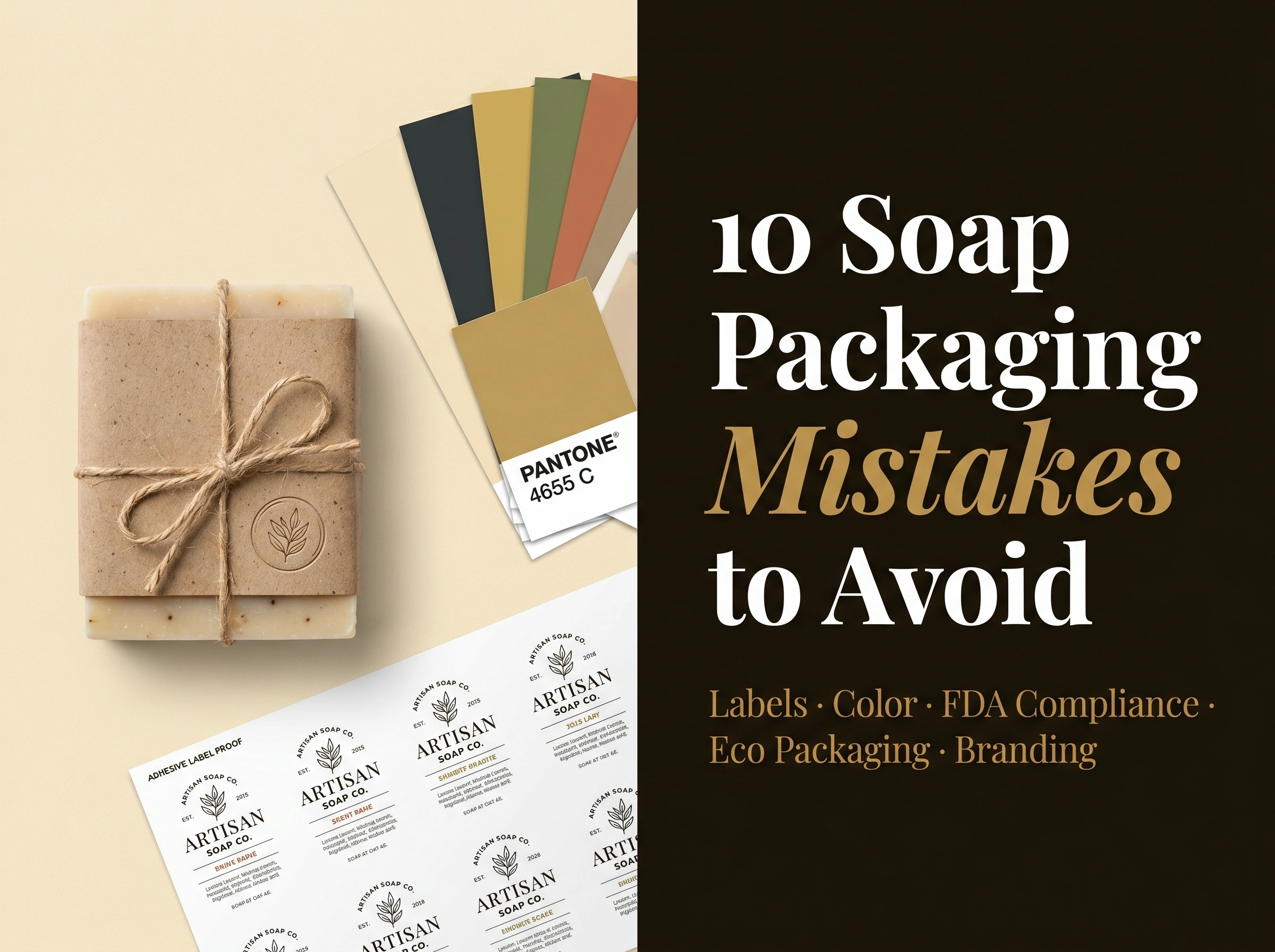
Mistake 01 No Clear Brand Identity (The Root of Every Other Mistake)
Here is the truth most guides skip: every other packaging mistake on this list is a symptom of this one.
When you do not know who your brand is, your soap label design becomes a series of random decisions. A font you liked. A color that felt nice. A layout that fit. The result is packaging that looks assembled, not designed and shoppers feel that difference instantly, even when they cannot explain why.
Your soap branding must answer three questions before a single design element is chosen:
- Who is your buyer, exactly? Not “women who like natural products.” Try: “Women aged 28–42 who shop at farmers markets, follow clean beauty accounts on Instagram, and spend $12–$18 on a bar of soap without hesitation.”
- What emotion should your packaging trigger? Trust? Indulgence? Playfulness? Clean simplicity? Your consumer perception goal drives every design choice that follows.
- Where does your product live? Bar soap branding for an Etsy shop needs different cues than hotel amenity soap packaging or an Amazon private label listing. Context changes everything.
Experience note: I worked with an artisan maker who had beautiful soap and a $14 price point but her packaging looked like it belonged at a dollar store. After rebuilding her brand identity around three words (wild, warm, rooted), and redesigning her Kraft paper soap wrap to match, her average order value jumped 34% in 60 days. The soap did not change. The packaging did.
The Fix: Write your three brand words. Pin them above your screen. Every design decision gets tested against them before it stays.
Mistake 02 Wrong Typography That Kills Readability
Packaging typography is not decoration it is communication infrastructure. The wrong font choice does not just look bad. It makes your soap label design physically harder to read, and in retail, unreadable equals invisible.
The most damaging label design errors around typography:
- Too many fonts. More than two typefaces on a single label creates visual noise. The eye cannot decide where to look, so it looks away.
- Script fonts at small sizes. Beautiful on a poster, illegible at 8pt on a bar soap wrapper. Always test at actual print dimensions.
- No contrast between label and font color. Light text on a pale background fails in dim lighting which is exactly the lighting in most retail stores.
- Ignoring hierarchy. Your brand name, product name, and INCI ingredient names should never compete for the same visual weight.
Proven font pairings that work for soap:
| Style | Display Font | Body Font | Best For |
|---|---|---|---|
| Artisan / Natural | Playfair Display | Garamond | Handmade soap packaging, farmstead brands |
| Luxury / Minimal | Cormorant Garamond | Futura Light | Luxury soap packaging, spa lines |
| Bold / Men’s | Bebas Neue | Source Sans Pro | Men’s soap branding, charcoal soap design |
| Playful / Kids | Nunito | Quicksand | Kids soap packaging |
| Clean / Modern | DM Serif Display | DM Sans | Minimalist soap design, wellness brands |
Critical Warning: When you send files to Prefine Packaging or any soap label printing vendor, outline your fonts or embed them. Missing fonts cause layout shifts that can ruin an entire print run a mistake I have seen cost makers hundreds of dollars.
Mistake 03 Ignoring Color Psychology (The Silent Salesperson)
Color psychology packaging is not a soft concept it is backed by decades of consumer behavior research. A 2023 study published in the Journal of Business Research found that color alone influences up to 85% of snap purchase decisions for personal care products.
The wrong palette does not just look off. It sends the wrong signal to the wrong buyer and they move on before they ever read your ingredients.
Soap packaging color guide by niche:
| Niche | Proven Colors | Avoid | Why |
|---|---|---|---|
| Organic soap packaging | Sage, terracotta, ivory, warm brown | Neon, electric blue | Nature signals: earthy, botanical, safe |
| Luxury soap packaging | Deep navy, black, gold, cream | Bright orange, lime | Premium signals: refined, exclusive |
| Men’s soap branding | Charcoal, slate, forest green, burgundy | Pastels, floral palettes | Masculine signals: strong, direct |
| Kids soap packaging | Primary brights, coral, sunshine yellow | Black, dark grays | Joy signals: safe, fun, energetic |
| Vegan soap label design | Leaf green, white, violet, sky blue | Heavy browns, synthetic-looking neons | Ethical signals: clean, plant-based |
| Hotel amenity soap packaging | White, champagne, pale gold | Busy patterns, loud colors | Service signals: quiet elegance |
Pantone color matching is non-negotiable once you move to professional custom soap box printing. Your screen uses RGB. Print uses CMYK. Without specifying exact Pantone references, your moss green becomes army green, and your blush becomes hot pink. Always confirm color mode with your soap packaging supplier before approving any proof.
Mistake 04 Skipping FDA & EU Label Compliance (The Costly Shortcut)
This is not a design mistake. It is a legal one and it is the mistake most likely to end your brand.
FDA cosmetic labeling regulations in the US and the EU Cosmetics Regulation in Europe are clear and non-negotiable. Every cosmetic packaging product sold in these markets must include specific information in specific formats. Missing even one required element can trigger:
- Removal from retail shelves
- Rejection by Amazon private label or Etsy seller programs
- FTC or FDA warning letters
- Customer chargebacks and product returns
Required elements US FDA cosmetic labeling:
| Element | Requirement | Common Mistake |
|---|---|---|
| Product identity | Clearly stated on principal display panel | Hidden in small type |
| Net quantity | In both metric and US customary units | Metric only, or missing entirely |
| Distributor info | Name and address of manufacturer or distributor | Missing from back panel |
| INCI ingredient names | Listed in descending order by weight | Listed in marketing order |
| Warning statements | Required for certain ingredients | Omitted to save space |
| Country of origin | Required for imported products | Often forgotten |
Expert note: INCI ingredient names (International Nomenclature of Cosmetic Ingredients) are the standardized Latin-based names required on all cosmetics sold in the US, EU, UK, and most global markets. “Coconut oil” on your label is charming but the law requires Cocos nucifera (Coconut) Oil. This is one of the top reasons Etsy sellers and Shopify store owners receive compliance warnings.
If you sell internationally, the EU Cosmetics Regulation adds additional requirements including a Responsible Person designation and a Product Information File. Consult a cosmetic regulatory specialist before entering EU markets resources like Packaging Digest can point you to verified specialists.
Mistake 05 Dismissing Eco-Friendly Packaging as Optional
It is not optional anymore.
A 2024 NielsenIQ report found that 73% of global consumers say they would definitely or probably change their buying habits to reduce environmental impact. In the handmade soap packaging and artisan soap branding space, this number is even higher your buyers chose your soap partly because it feels better than a mass-market alternative. Plastic-wrapped packaging undercuts that story at the moment of purchase.
Sustainable packaging options ranked by impact and cost:
| Material | Visual Appeal | Cost vs. Plastic | Best For |
|---|---|---|---|
| Kraft paper soap wrap | High rustic, natural | 10–20% more | Farmers market, artisan brands |
| Seed paper soap labels | Very high memorable | 30–50% more | Premium gifting, viral unboxing |
| Compostable soap boxes | High clean, premium feel | 20–35% more | Luxury soap packaging |
| Recycled card with soy ink | High versatile | 5–15% more | Any niche |
| Plastic-free soap packaging (banding only) | Minimal | Equal or less | Minimalist, zero-waste brands |
| Plantable paper inserts | High shareable | 15–25% more | TikTok soap unboxing moments |
Sustainable soap wrap is a marketing asset, not just an ethics choice. Print it on the label: “Packaged in 100% compostable materials.” That single line converts sustainability-minded buyers who were on the fence and it builds the consumer perception of trustworthiness that drives repeat purchases.
Pro Tip: Source bulk soap packaging wholesale from sustainable suppliers to offset the higher per-unit cost. At 500+ units, the price gap between eco-friendly packaging and standard plastic narrows significantly.
Mistake 06 Overcrowding or Under-Designing the Label
Two opposite mistakes. Both fatal to shelf appeal.
Overcrowding happens when you treat your label as a brochure. Every benefit, every award, every ingredient highlight crammed onto a bar soap wrapper the size of a playing card. The result: poor visual hierarchy, zero focal point, and a label that reads as desperate rather than confident.
Under-designing happens when you strip the label back so far it has no personality. A name on a white background is not minimalism it is a missed opportunity to connect.
The 5-Element Label Rule (proven across hundreds of soap packaging design projects):
- Brand name largest element, immediately visible
- Product name or scent secondary, distinct from brand name
- Hero benefit one line maximum (deeply moisturizing · cold-process · vegan)
- Net weight + compliance info present but visually subordinate
- One visual anchor an illustration, texture, or design element that makes the label memorable
Scent visualization design is one of the most overlooked tools in this space. A hand-drawn lavender sprig, a slice of citrus, a sprig of eucalyptus a single well-placed illustration communicates fragrance, mood, and quality faster than any block of text. This is why top luxury soap packaging brands invest in custom illustration.
Visual hierarchy test: Hold your label at arm’s length and squint. What do you see first? That should be your brand name. Second? Product name. If you cannot tell your hierarchy needs work.
Mistake 07 Treating the Unboxing Experience as an Afterthought
If your soap ships directly to customers through your Etsy shop, Shopify store, or direct website the unboxing moment is your most powerful brand touchpoint. It is more intimate than a shelf encounter, more memorable than an ad, and infinitely more shareable.
A TikTok soap unboxing video from one happy customer can reach 50,000 people overnight. But that only happens when the packaging experience is worth filming.
Luxury soap gift packaging brands understand this instinctively. Every layer is a reveal. Every material choice sends a message. Here is what that looks like in practice:
Unboxing experience audit:
Layer Budget Version Premium Version Impact Outer mailer Plain brown box Branded box with logo stamp First impression Inner wrap Tissue paper Branded tissue + wax seal Anticipation Product wrap Basic Kraft paper soap wrap Custom-printed wrap with brand story Connection Insert None Handwritten thank-you card Loyalty trigger Extra None Sample of next product Upsell seed Scent None Dried botanicals or cedar chip Sensory memory You do not need all of these. You need some of them chosen deliberately based on your brand identity and price point.
Mistake 08 Designing for Everyone (Which Means Designing for No One)
Soap packaging design that tries to appeal to every buyer ends up resonating with none of them. The most successful brands in this space own a niche completely and their cosmetic packaging reflects that ownership at a glance.
Niche packaging identity guide:
Niche Visual Cues Tone Key Claim Organic soap packaging Botanicals, earthy textures, handwritten fonts Warm, nurturing Certified organic, cold-process Vegan soap label design Leaf motifs, clean white space, violet accents Ethical, direct 100% plant-based, cruelty-free Artisan soap branding Hand-illustration, rough-edge textures, serif type Personal, craft-focused Small batch, handmade Men’s soap branding Bold type, dark palette, minimal decoration Direct, confident Deep cleanse, no nonsense Luxury soap packaging Gold foil, embossing, structured box Elevated, quiet Premium ingredients, expertly crafted Goat milk soap label Farmstead imagery, pastoral palette, script accents Wholesome, local Farm-fresh, skin-nourishing Charcoal soap design Dark backgrounds, high contrast, modern sans-serif Functional, edgy Detoxifying, pore-clearing Kids soap packaging Characters, bright color blocks, bold round fonts Playful, safe Gentle, tear-free, fun Hotel amenity soap packaging Ivory, champagne, restrained elegance Refined, understated Crafted for comfort Pro Tip: Browse The Dieline the gold standard resource for product packaging inspiration filtered by your exact category. You will immediately see the visual language your niche buyers already respond to. Then find your differentiated angle within that language.
Mistake 09 Skipping Pre-Print Testing
Even experienced designers using Adobe Illustrator make pre-print mistakes that cost real money. Colors shift in CMYK. Text blurs at small sizes. Margins that look generous on screen get swallowed by die-cut edges in production.
Pre-print testing checklist:
- ✓ Export at 300 DPI minimum in CMYK color mode
- ✓ Specify Pantone references for critical brand colors
- ✓ Include 3mm bleed on all edges
- ✓ Order a physical proof from your soap packaging supplier before full run
- ✓ Print a test label at home and wrap it around the actual bar
- ✓ Check label in both bright and dim lighting (retail simulation)
- ✓ Verify all INCI ingredient names are spelled correctly errors on cosmetics labels require a full reprint
- ✓ Confirm font files are embedded or outlined in your export
If you design in Canva, always download a soap label template download at the correct dimensions before starting, export as PDF Print (not standard), and confirm bleed settings are enabled. Canva‘s default export is RGB manually switch to PDF with marks and bleed for print-ready files.
Mistake 10 Ignoring Consumer Perception Trust Signals
This is the overlooked mistake that separates labels that convert from labels that just exist.
Consumer perception of trustworthiness is built through specific visual signals that shoppers recognize often subconsciously. When these signals are present, buyers feel confident. When they are absent, doubt creeps in, and the product stays on the shelf.
Trust signals that boost conversion on soap labels:
Trust Signal How to Apply It Impact Certification badges Cruelty-free, USDA Organic, vegan logos High immediately legible Ingredient transparency “Only 6 ingredients” or full list prominently placed High builds confidence Batch or lot number Small but visible signals quality control Medium appeals to informed buyers Made in USA / UK / local Origin statement on front panel High in specific markets Social proof indicator “Bestseller” or “5,000+ customers love this” High for Etsy sellers and Shopify store listings Founder story snippet 1–2 lines about who made this and why Medium builds emotional connection QR code to full ingredient info Links to your website for full transparency Growing especially for clean beauty packaging 2026 buyers FAQs
What are the most common soap packaging design mistakes?
The most common soap packaging design mistakes are: no defined brand identity, poor packaging typography, wrong color psychology packaging choices, missing FDA cosmetic labeling requirements, ignoring eco-friendly packaging options, overcrowding the label, a weak unboxing experience, and failing to design specifically for the target niche.
What must be on a soap label to meet FDA requirements?
Under FDA cosmetic labeling rules, a soap label must include: the product identity, net weight in metric and US units, the manufacturer or distributor’s name and address, a full ingredient list using INCI ingredient names in descending order by weight, and any required warning statements.
What is the best packaging for handmade soap?
The best handmade soap packaging uses eco-friendly packaging materials such as Kraft paper soap wrap, recycled card stock, or compostable soap boxes paired with clean packaging typography, a strong brand identity, and full FDA label compliance. Minimalist soap design with one clear visual anchor consistently outperforms cluttered labels in consumer testing.
What font should I use on a soap label?
Choose a maximum of two fonts for any soap label design: one display font for your brand name and one legible body font for ingredient lists and compliance text. Test both at actual print size. Decorative scripts often fail at small sizes during soap label printing always proof before a full run.